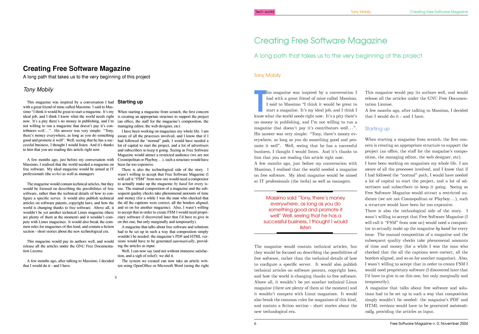
When I received the first email from Tony asking me to set up the typesetting subsystem for Free Software Magazine (FSM), I was proud... and terrified. I have spent the last six years of my life using LaTeX and, ultimately, TeX, to typeset single articles, songbooks, my thesis, CV’s, flyers, and letters. Even though my knowledge of the companion packages and classes was pretty good, the first thing I thought was: “How is it possible to compose a whole magazine, article by article, and at the same time build the table of contents (ToC) in the same way as the composition of books?” The problem is that every article has a title, a subtitle and one or more authors: all of this information has to be placed neatly in the ToC. Even after a bit of research, I was still wondering: “Will I be able to do a proper job?”
For the few readers who still don’t know what TeX and LaTeX are: TeX is a typesetting system [1] written by Donald E. Knuth, created to compose scientific books and papers. LaTeX is a macro package [2] based on TeX that was originally written by Leslie Lamport. It’s used to give a structure to the composition, and let the author concentrate on the paper’s content rather than the paper aspect.
When I received the first email from Tony asking me to set up the typesetting subsystem for Free Software Magazine (FSM), I was proud... and terrified
Of course, the first answer to every question about TeX can be found in the Comprehensive TeX Archive Network (CTAN) [3]. After a bit of research, I discovered that there was a class called journal, which included the class paper. Journal was written to accomplish something similar to what I was trying to do. However, we wanted to typeset a real magazine, and not a scientific journal; so, we needed quite a few additional features.
Following the LaTeX Project Public License [4], I renamed each of the classes to openjournal and openpaper (even if I didn’t plan on releasing them just yet). Well, the foundations were there: at that time we were able to compose the magazine, even if it wasn’t as fancy-looking as the average reader might expect.
In order to figure out which elements were required to compose a single paper (or article), Tony provided me with a sample xml file, containing all such elements. Some of these elements raised my eyebrows: zoom, and textbox; and then there were the more typical: figure, table, author, and title.
While some of them had a direct correspondence in LaTeX, others were more specific.
Well, at that point Tony received my answer (a brave “I think I can do it!”), and my part of this adventure started.
Organising the work
The journal class did a very good job creating the article’s basic layout, but it wasn’t enough for our goals. We wanted to create a magazine, not a journal; so our contents needed to be presented seriously and in colour, typographically speaking. I arranged a set of colours to characterise the elements of FSM, and programmed the class to use them.
I then had to choose a set of fonts to typeset the text. I chose the AvantGarde font as the sans serif. A serif is the light line or stroke projecting from the ends of the main stroke of a Roman character letter; a sans serif font is a font without serifs. The related package defines which font to use as the serif font and which font to use as the typewriter (TeX defines this as teletype, or tt) font.
It was time to organise the layout. I wanted a double column page, with a single-column title for every article. I also wanted footers and headers with information about:
- the page number
- the name, year and issue number of the magazine
- the section’s name
- the article title
- and the author’s name
First, I started working on the columns. A characteristic of LaTeX is that:
Sure, compared to your off-the-shelf MS Word page, it looks awfully narrow. But take a look at your favourite book and count the number of characters on a standard text line. You will find that there are no more than about 66 characters on each line. [5]
I believed that it would be better for us not to have wide empty spaces around the actual text. So, I modified the dimensions of the page, while not changing the dimensions of the paper (DIN A4).
I gave Tony feedback allowing him to write the converter from XML tags to LaTeX commands and environments
That was the easier stage of the job, accomplished by modestly tweaking the class’ code.
At that point, I gave Tony some feedback allowing him to write the converter, which would translate the articles from XML into LaTeX. I arranged a document, which explained the correspondence of each XML tag with its LaTeX equivalent. While Tony wrote the finite state automaton that performed the conversion, I programmed the commands to put the text-boxes, the zooms, and the author’s biography on the page. I also wrote some code to implement a floating box for the listings, but in the end we decided not to use it.
Typesetting the magazine
When Tony had finished programming the converter, I carried on programming in TeX to add features to the LaTeX class.
The ToC
I didn’t think that the ToC as written by the paper class was appropriate for Free Software Magazine.
The main problem was that FSM had different sections: Focus, Tech world (technical articles), and Word world (non-technical articles). The section name was embedded in every article.
We didn’t want the section name to be repeated after the name of every article in the ToC
When rendering the ToC, we wanted the sections’ names to appear only once, before the articles, which were part of that section. However, when the class was instructed to write the section name before a paper entry in the ToC, it was repeated for every article.
To solve this problem I wrote a little function to count how many times a section name was read consecutively: only the first time that string was used would it actually be printed in the ToC.
The zooms
Another command involved the arrangement of the zooms (or “callouts”). The zooms are short sentences, which appear in bigger font within the article. They are important as they make composition possible: they allow the article’s length to be adjusted as needed, without changing its content. I wrote this command so that it placed the “zoomed text” where it is issued, without any automatic positioning.
A**nother “pretty” feature of published magazines is the “big character” starting an article (also called the _drop cap_)**
The paragraph start
Another “pretty” feature of published magazines is the “big character” starting an article (also called the drop cap). The first code I ever used to typeset this feature was that contained in the class IEEEtran. I changed the size of the font (four rows instead of two), as well as its colour and the font family: the original class used Times Roman as a replacement of Computer Modern Roman; our class used the AvantGarde sans serif font for issue 0 of FSM. I believed the code worked pretty well, but using it here was impossible due to several problems:
- The “drop cap” character varied greatly in size, which was not acceptable
- The rest of the word was placed in the wrong position, that is to say too close to, or too far from, the drop cap.
The author of the IEEEtran class tried to accomplish the IEEE transactions style, which says that the first word is all uppercase; this prevents the first problem, as will soon be clarified.
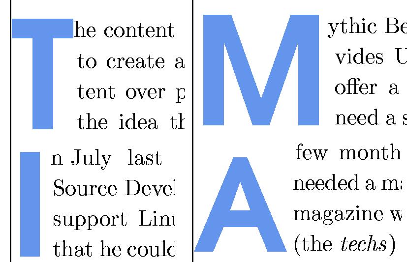
Let’s examine the problem in more detail (see the figure). The ‘T’ and the ‘M’ are slightly taller than the ‘I’; and the ‘A’ is shorter than the ‘I’. Why this strange behaviour? The dimension of the drop cap was calculated according to the height of the article’s first word.
Every letter has a width (how much space it occupies horizontally), a height and a depth (how much space it occupies vertically, respectively, above and below the baseline). So a letter can be treated as its bounding box of dimensions (width, height+depth). The baseline, as easily understandable, is the imaginary line at the base of a character used to line up the characters to form a word. It is also easily understandable that the height of a word is equal to the greatest height of its characters.
‘T’ and ‘M’ are followed by “ascending characters” (a ‘t’ and an ‘h’). So the corresponding first character is sized accordingly. Since the IEEEtran class puts the first word in uppercase, the characters are all of fixed height, and the drop cap has always the same height. The word “In” doesn’t contain ascending characters, so the ‘I’ is not as tall as the ‘T’ in the previous cases. The last example shows a starting word composed by only one character: ‘A’. This means that ‘A’ is followed by characters of height zero: this is why the ‘A’ is so short. A solution was to size the drop cap as if the first word always contained a fixed ascending character (i.e., an ‘I’).
The other problem we see is that the first row is almost never justified, while the second, third and fourth rows of the drop cap are; in three cases the lines are too long and are too close to the drop cap, in the fourth case the line is too short and, somehow, justified to the right. The latter problem is almost never present in the original class. The reason for the shorter line is a blank space added by the one-character word, while the longer lines are due to a correction factor (technically, a kerning) that seemed to work in the original class (where the font was always the same) but not in ours. A little check on the dimension of the rest of the starting word prevents unwanted space. In the textbox you can compare the original and the modified code for the drop cap (functions PARstart and parstart).
The TeX code for the functions PARstart of IEEEtran.cls and parstart, the modified version for openpaper.cls
\def\PARstart#1#2{
  \begingroup\def\par%
    {\endgraf\endgroup\lineskiplimit=0pt}
  \setbox2=\hbox{\uppercase{#2} }
  \newdimen\tmpht
  \tmpht \ht2
  % by making it 1.1\baselineskip,
  % we get a first letter that drops a
  % little below the baseline.
  % The result is extremely close to what
  % IEEE uses.
  \advance\tmpht by 1.1\baselineskip
  \font\hhuge=ptmr at \tmpht
  \setbox1=\hbox{{\hhuge #1}}
  \count7=\tmpht
  \count8=\ht1
  \divide\count8 by 1000
  \divide\count7 by\count8
  \tmpht=.001\tmpht
  \multiply\tmpht by \count7
  \font\hhuge=ptmb at \tmpht
  \setbox1=\hbox{{\hhuge #1}}
  \noindent \hangindent1.05\wd1
  \hangafter=-2
  {\hskip-\hangindent%
   \lower1\ht1\hbox{\raise1.0\ht2\copy1}%
   \kern-0\wd1}\copy2\lineskiplimit=-1000pt}


\def\parstart#1#2{
  \begingroup\def\par{\endgraf\endgroup\lineskiplimit=0pt}
  \setbox2=\hbox{#2 }
  \setbox3=\hbox{I}
  \newdimen\tmpht
  \tmpht\ht3
  \advance\tmpht by 3\baselineskip
  \font\hhuge=pagd8t at \tmpht
  \setbox1=\hbox{{\hhuge #1}}
  \count7=\tmpht
  \count8=\ht1
  \divide\count8 by 1000
  \divide\count7 by\count8
  \tmpht=.001\tmpht
  \multiply\tmpht by \count7
  \font\hhuge=pagd8t at \tmpht
  \setbox1=\hbox{{\hhuge \color{HeadingsFont}#1}}
  \noindent
  \hangindent=\wd1
  \hangafter=-4
  {\hskip-\hangindent%
   \lower1\ht1\hbox{\raise1.0\ht3\copy1}}%
  \setbox4=\hbox{ }%
  \ifdim\wd2=\wd4%
  \else%
    \advance \hangindent by \wd2%
    \copy2%
    \advance \hangindent by -\wd2%
  \fi%
  \lineskiplimit=-1000pt%
}
This was the last feature programmed for the “written part” of the magazine. Finally, I had to write a little set of commands to place the cover image and the ads (in full page, half page, and column formats).
The first version of the code was ready to typeset the complete magazine, and you can see the result at FSM issue 0, while in the following figure you can see the same paper typeset with and without “my” classes.
Conclusion
In this short article I summarised the very first part of the “LaTeX story” of FSM (you can read the other side of the story in [6]).
After issue 0 was published, a lot of things changed: a professional graphic designer (Alan at Qreate) redesigned the magazine, and I had to reprogram the class to conform to the new look; I did a lot of bug fixing and code modifications and additions; when we thought we had finished, we discovered that in order to actually print the magazine we needed to create it in the US letter format (rather than A4) and that every image needed to “bleed” (that is, it had to go over the border of the page). We also created a system to generate a high and a low resolution version of the magazine (for printing it and downloading it) and generate the ISSN bar-code.
But this is another story... (If you are interested in it, please let me know!)
Bibliography
[1] D. E. Knuth. The TeXbook. In Computers and Typesetting, volume A. Addison Wesley, Reading, MA., millennium edition, 2001.
[2] L. Lamport. LaTeX: A Document Preparation System. Addison Wesley, Reading, MA., 2nd edition, 1994.
3(http: //www.ctan.org), 2005.
4(http://www.latex-project.org/lppl.html), 2005.
[5] T. Oetiker et al. The Not So Short Introduction to LaTeX2e. Document lshort.dvi in the base LaTeX distribution, 1999.
[6] T. Mobily. Creating Free Software Magazine. Free Software Magazine, issue 1, 2005.