There are several layers at which a GNU/Linux system's appearance can be customized. By far the most visible, especially on a multi-user machine, is the login manager screen. KDM (the KDE desktop manager) has a highly-flexible and easy-to-use XML-based theme system. If you can draw what you want, you can make it happen with a KDM theme. I'll talk you through the construction of one simple theme I designed for my ASUS Eee PC.
Despite the fact that the KDM theme structure and syntax is quite simple, I have not found any adequate documentation for it. I learned how to use it by reverse-engineering several existing themes. Hopefully, this column will help to rectify the apparent omission. It's possible to go much further with themes than you can with simple configuration changes to the login manager (I demonstrated these kinds of simple changes in an earlier column).
To follow along, you will need some kind of graphics editing tools (I used Inkscape and Gimp, but you could easily use other programs for this), and you will need to understand basic XML syntax (XML is very much like HTML, so if you are used to looking at HTML you won't have much difficulty).
A KDM theme for my Eee PC
Partly because of the hardware limitations of the Eee PC, and because it will generally only be used by me, I want to keep my design simple. I don't want a visual user list, because there's no point: if anyone but me logs in, they should just type. As with my other client systems, the computer will be named after a fictional character, and so I will design the theme around that character. Unlike most, this character is one I can freely publish the artwork for, because it was one of the characters we designed for the unfinished Light Princess adventure game, and is thus under a free license (albeit a slightly weird one: the Design Science License. There is a long story behind that). This is partly to encourage me to think about finishing the game, but that's another story entirely.
Creating the artwork
The best way to start is to draw the artwork. I used Inkscape for this, making only a few minor tweaks to the exported bitmaps in Gimp. You should keep in mind some of the features of KDM in doing your own design, especially:
- Username text entry (and label)
- Password text entry (and label)
- User list (may include avatars)
- Login button
- Additional buttons for: System, Session, Language, and Disconnect
- Host welcome message
- Caps-lock warning message
- Delayed login notification message
I did not provide for all of these in my design. For example, I have no space for a user list, because I don't want one on my Eee PC. This is fine -- features you don't provide simply won't be available when using your theme. My final concept drawing is "Figure 1".
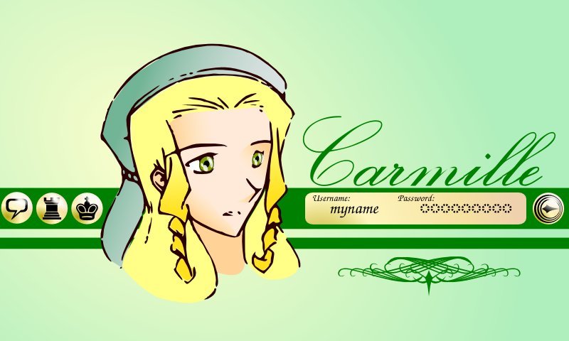
De-constructing the artwork for scalability
Now I am designing specifically for the 800x480 screen of the Eee PC, which is a fairly odd size. However, I would like for the layout to work on any screen, which means taking into account not only the differences in size and resolution, but also in aspect ratio. The face graphic would look pretty awful if it were stretched to fit the screen. But the background with stripes should obviously be stretched to fit.
Similarly, the login elements and the additional menus are arranged into two cartouches or "rects" which I've laid out on the thick stripe in the original drawing. These will look better if left at their base resolution and positioned to fit at the edges of the screen (and still within the stripe).
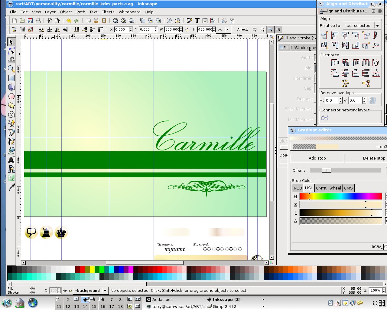
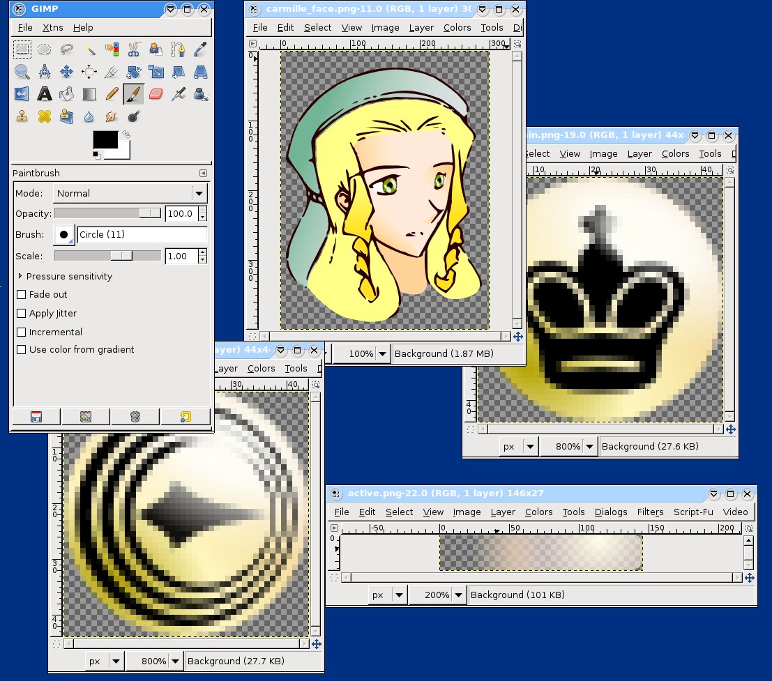
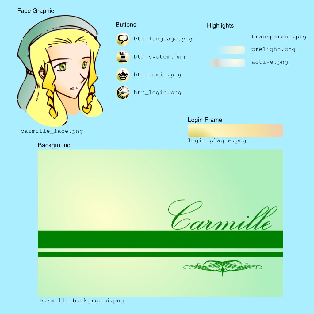
So I'll break these up into separate graphics. Finally, I will also need some highlighting overlays. These will be used to indicate "mouseover" and "click" actions on buttons. Figure 2 shows the full breakdown of the elements we need. As shown in figure 3, I cropped and expanded the images to get slightly more convenient and consistent sizes.
The screen model used for KDM themes
In order to layout the screen, you will need to understand the layout metaphor that KDM uses. Essentially, layout is viewed as a series of nested compositions of "items". Each consists of elements laid one over the other, positioned and scaled according to attributes assigned to each element. Whenever an element appears within a parent element (in the XML file), the coordinates are interpreted relative to that element. The outermost element, of course, is positioned relative to the screen coordinates. This nested layout metaphor is illustrated in Figure 4.
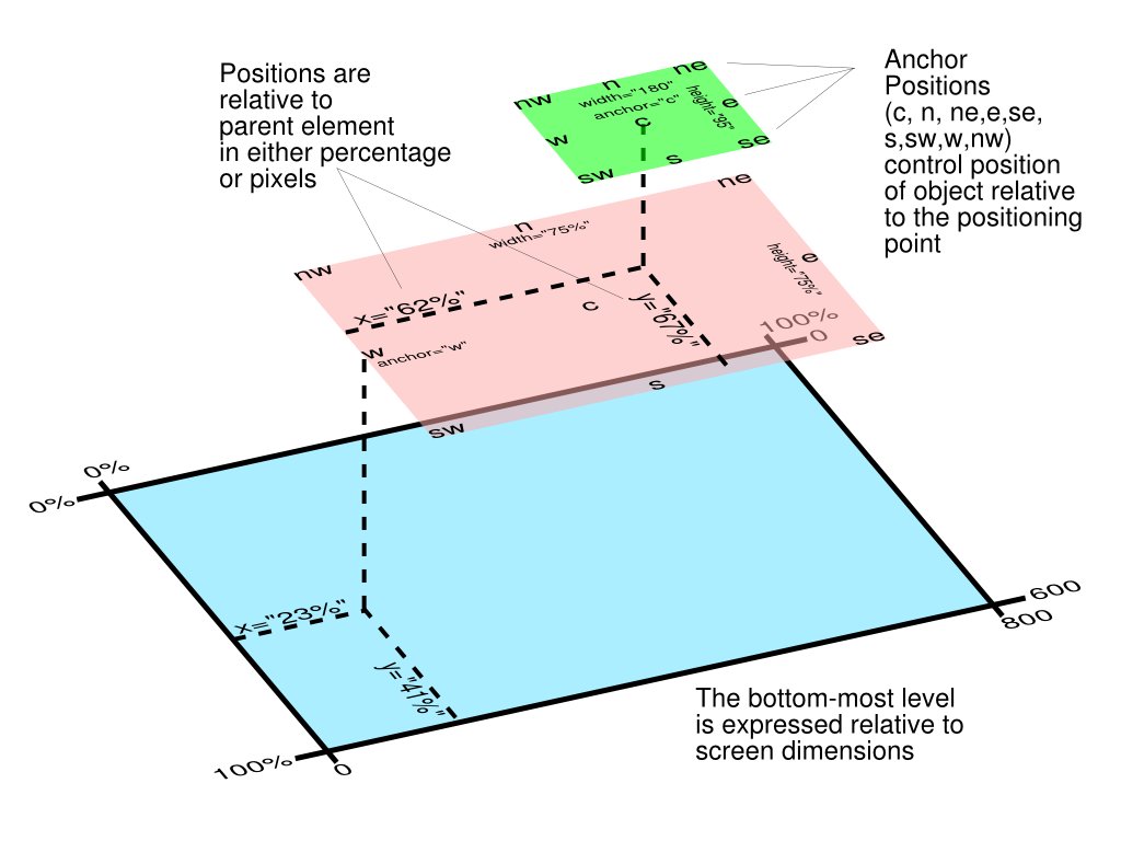
I have used, including "rect", "pixmap", "label", and "entry" items in my layout (there may be some others, but these are certainly the most important).
A "rect" can be understood as a cutout rectangle of material. It can have a color and a transparency or "alpha" assigned to it, but in my case, I have used only perfectly clear (alpha=0.0) rects. These are used mainly to control composition of elements.
A "pixmap" is just an image. "Label" is a text field which will be filled out by KDM based on configuration settings (you can change these fields from the control panel in KDE). "Entry" is a field which the user will type into: in my case, there are just the "username" and "password" entry fields to consider.
Creating the theme directory
Now we'll need to create a directory for the theme files. We'll pack this up into a tarball to make the actual "theme file", but it is actually just an archived directory. I've named this one, "carmille_kdm".
In this directory, I created the separate images I need. Some people use quasi-standard names for these files, but they can be named anything, so I have given them descriptive names:
carmille_background.png(the background with stripe and cursive hostname)carmille_face.png(the face graphic)- Buttons:
btn_login.png,btn_system.png,btn_admin.png, andbtn_language.png - Highlights:
transparent.png,prelight.png, andactive.png login_plaque.png(the background for the username and password)
In addition, another image file, carmille_kdm.jpg is provided to use as a screenshot when enabling the theme.
Then there will be two control files: carmille_kde.xml and GdmGreeterTheme.desktop which tell KDM what to do with the image files.
Creating carmille_kde.xml
The control file starts with standard XML file housekeeping: we need to identify the syntax and the encoding of the file, and then open the "greeter" element, which is the container element for the whole file:
<?xml version = '1.0' encoding = 'UTF-8'?>

<!DOCTYPE greeter SYSTEM "greeter.dtd">

<greeter>
After this, we start building up the display from the bottom (or back) up (or forward). The first layer is the background image, which we'll set to be scaled to fit the screen (without concern for the aspect ratio):
    <!-- Background: stretched to fit screen -->

    <item type="pixmap">

        <normal file="carmille_background.png" />

        <pos x="0" y="0" width="100%" height="100%" />

    </item>
This is an "item" element, with the "type" attribute determining what sort of object it is -- in this case, of course, a bitmap image or "pixmap". The "normal" element appears in all of the item types, and determine how the item is drawn (why it's called "normal" will become apparent later on). For a pixmap, it just identifies the file source for the image.
The "pos" element is probably the trickiest part of understanding the layouts. This is one of the simplest cases: the x and y values determine the location of the upper-left corner of the image (in standard computer graphics coordinates which start at the upper-left of the screen with x increasing to the right, and y increasing towards the bottom. Note that when the value is 0, it doesn't matter whether you are using pixels or a percentage of the screen. I assume 0% would also work, though I haven't tried it.
The width and height are both set to 100%, so the image will be scaled to fit the entire screen, which is what I want.
Next, I want to place the character's face on the screen, without scaling. This is done by the following code:
    <!-- Carmille's Face: positioned, but not resized -->

    <item type="pixmap">

        <normal file="carmille_face.png" />

        <pos x="35%" y="55%" width="300" height="400" anchor="c" />

    </item>
Again, this is a pixmap with the filename specified. The "pos" element is a bit trickier this time around. The x and y coordinates are now percentages, identifying a relative position on the screen. Since the image is stretched to fit the screen, this will be a consistent location on the background graphic: towards the top of the thicker horizontal stripe in my layout, towards the left side of the screen. I then specify the width and height (these are simply the true width and height of the image). Finally, I indicate the "anchor". This is the part of the image that will be placed at the (x,y) coordinates specified. In this case, I've indicated "c" for "center". So, the image will be centered at the (35%,55%) point on the screen, but left unscaled (so it will take up 300x400 real pixels on screen).
The login cartouche
The next challenge is constructing the cartouche of widgets that will appear on the right side of the screen and control the normal login process. We start with an invisible box or "rect" that will position the whole cartouche:
    <item type="rect">

        <normal alpha="0.0" color="#ffffff" />

        <pos x="99%" y="61%" width="370" height="44" anchor="e" />
The color is basically irrelevant here because the alpha is set to 0.0, which corresponds to "fully transparent". The position is given as a screen percentage, vertically centering the cartouche on top of the thick stripe on the background, and placing it almost all the way to the right. Anchoring it on the "e" (for "east") means the center of the right side of the cartouche will be lined up at this position.
Nested within this cartouche, we place a pixmap representing the "plaque" object which I've designed as a background for the login fields. Within that, are nested the individual labels (e.g. the actual text "Username:"), and the input fields into which you type your username and password.
The "normal" element for the "label" items specifies the font to be used and the color it should appear in. Note that the font name includes the font size and attributes such as "italic" or "bold". Of course, you must take care to ensure that the font you use is installed on your system, and font names can be somewhat finicky. I had to try a few iterations with this before I found the correct name to use. I found the output of fc-list to be useful (part of "fontconfig") in determining the correct names to use.
The label item also uses a new element, called "stock", which tells KDM which text to put into the label (the actual text is not part of the theme, but can be configured from the "Login Manager" on the KDE System Administration menu in the Control Panel).
Recognized "stock" text includes:
- welcome-label (label used as a greeting to the user)
- username-label (the label over the username entry)
- password-label (the label over the password field)
- caps-lock-warning (a warning in case you have caps-lock on)
- session (a label for the "session" button)
- system (a label for the "system" button)
- disconnect (a label for the "disconnect" button)
- quit (a label for a "quit" button)
- timed-label (a label for a delayed-login message)
We'll also place the entry boxes for typing in your username and password. I was not able to find any way to control the font used in these boxes; it's possible that it's just not changeable with KDM themes. My theme simply positions them in an appropriate spot.
For the entry boxes, it's necessary to use the correct "id" attributes on the item: user-entry and pw-entry in order to let KDM know what to do with these fields.
Here's the resulting code for the login text:
        <!-- "plaque" image for login text -->

        <item type="pixmap">

            <normal file="login_plaque.png" />

            <pos x="0" y="0" width="310" height="44" />


            <item type="label">

                <pos x="10" y="2" anchor="nw" />

                <normal font="URW Chancery L 14" color="#002200" />

                <stock type="username-label" />

            </item>


            <item type="entry" id="user-entry" >

                <pos x="20" y="23" width="120" height="17" anchor="nw" />

            </item>


            <item type="label">

                <pos x="130" y="2" anchor="nw" />

                <normal font="URW Chancery L 14" color="#002200" />

                <stock type="password-label" />

            </item>


            <item type="entry" id="pw-entry" >

                <pos x="160" y="23" width="120" height="17" anchor="nw" />

            </item>

        </item>
Next, we need to place the login button. This is still within the login cartouche, but is separate from the plaque image (in my design -- of course you can arrange this anyway you want for your own designs). This is a little more complicated, due to the animation of the button:
        <!-- Login button -->

        <item button="true" type="pixmap" id="login_button">

            <pos x="-1" y="0" width="44" height="44" anchor="ne" />

            <normal     file="btn_login.png" />

            <!-- overlays -->

            <item type="pixmap" >

                <pos x="0" y="0" width="100%" height="100%" />

                <normal     file="transparent.png" />

                <prelight   file="prelight.png" />

                <active     file="active.png" />

            </item>

        </item>

    </item>
Buttons need to have the button="true" attribute to identify them, and the correct "id" attribute must be used to let KDM know what the button controls.
Note that in addition to "normal", we now have elements for "prelight" and "active". This is why the "normal" element is called "normal": it controls the appearance of an item on the screen when it is in its normal, inactive state. When the item is a button, and the mouse passes over it, it will take on the "prelight" appearance, and then, when the mouse is clicked, it will take on the "active" state.
Since I simply want to overlay a graphic glint effect on the button to indicate activity, and since I want to use the same glint on all of the buttons, I've structured this as an overlay. This takes advantage of the fact that the button state is inherited by nested objects, so the correct source will be used for the overlay, while the same image will be used for the basic pixmap for each button.
If the size of the glint overlays don't match the button, you needn't worry: the image will be scaled appropriately. I've arrange this with the pos element, which fills the parent object with the image (noting again that this is relative, so the size is 100% of the 44x44 pixel button image in this case).
Also, we have a final </item> to close off the rect item defining the login cartouche.
At this point, you should understand all of the basic concepts needed. All that's left is to create the other cartouche, with the remaining buttons. These are the buttons that bring up the menus in KDM (as with the login text, I didn't find any way to theme the menus themselves). For completeness, here is the remaining code:
    <!-- Menus Cartouche -->


    <item type="rect" >

        <pos x="1%" y="61%" width="145" height="44" anchor="w" />

        <normal alpha="0.0" color="#ffffff" />


        <!-- Languages Menu -->

        <item button="true" type="pixmap" id="language_button">

            <pos x="0" y="0" width="44" height="44" anchor="nw" />

            <normal     file="btn_language.png" />

            <!-- overlays -->

            <item type="pixmap" >

                <pos x="0" y="0" width="100%" height="100%" />

                <normal     file="transparent.png" />

                <prelight   file="prelight.png" />

                <active     file="active.png" />

            </item>

        </item>


        <!-- System Menu    -->

        <item button="true" type="pixmap" id="system_button">

            <pos x="50%" y="0" width="44" height="44" anchor="n" />

            <normal     file="btn_system.png" />

            <!-- overlays -->

            <item type="pixmap" >

                <pos x="0" y="0" width="100%" height="100%" />

                <normal     file="transparent.png" />

                <prelight   file="prelight.png" />

                <active     file="active.png" />

            </item>

        </item>


        <!-- Administration Menu -->

        <item button="true" type="pixmap" id="session_button">

            <pos x="100%" y="0" width="44" height="44" anchor="ne" />

            <normal     file="btn_admin.png" />

            <!-- overlays -->

            <item type="pixmap" >

                <pos x="0" y="0" width="100%" height="100%" />

                <normal     file="transparent.png" />

                <prelight   file="prelight.png" />

                <active     file="active.png" />

            </item>

        </item>


    </item>

</greeter>
The last line, of course, closes off the XML file.
Other features
I haven't used a user list widget in this layout, but of course, it can be very nice to have one. This is achieved using a rect and the "show" element, with the "type" attribute identifying it with userlist, like this:
    <item type="rect" id="userlist">

        <pos x="5" y="5" width="200" height="400"/>

        <show type="userlist"/>

    </item>
You may find it useful to look at more existing themes, as it is very likely that there are other features I haven't used.
The GdmGreeterTheme.desktop file
There is one more file which must be provided in the theme directory, and that's the configuration file that provides the metadata for the theme (it also identifies the location of the XML file above). The file is called GdmGreeterTheme.desktop, and here are the complete contents of mine:
# KDM theme based "Carmille"/"Chancellor's Daughter" from "The Light Princess" (Game)

[GdmGreeterTheme]

Encoding=UTF-8

Greeter=carmille_kdm.xml

Name=Carmille (from The Light Princess), 09

Author=By Terry Hancock, based on art by Katherine Chi

Copyright=(C) 2000-2009 Design Science License

Screenshot=carmille_kdm.jpg
This file is hopefully self-explanatory. The encoding, greeter XML file, name, author, copyright, and screenshot are provided. These are presented to the user when selecting the theme from a list in the KDM Theme Manager. Again, note that this file is the one with the controlled name: KDM finds the XML file by reading this file.
Testing it out
As with most layout or programming jobs, you will probably go through a number of test cycles. This means logging in and logging out of KDE a lot. You'll also want to install the KDM Theme Manager for convenient installation of the theme on each iteration.
After a few tries, you should be able to get your layout working the way you want, and the login screen will be a joy to look at.
Licensing Notice
This work may be distributed under the terms of the Creative Commons Attribution-ShareAlike License, version 3.0, with attribution to "Terry Hancock, first published in Free Software Magazine".
The original and all derivatives of the drawing of "The Chancellor's Daughter"/"Carmille" from "The Light Princess", originally (C)2000 Katherine Chi, with coloring and modifications by Terry Hancock are released under the Design Science License. All of my illustration content (where separable) may also be used under the terms of the Creative Commons Attribution-ShareAlike License, version 3.0, with the same attribution as the text.